Creating a face to match the brand name
-
BRAND CREATION
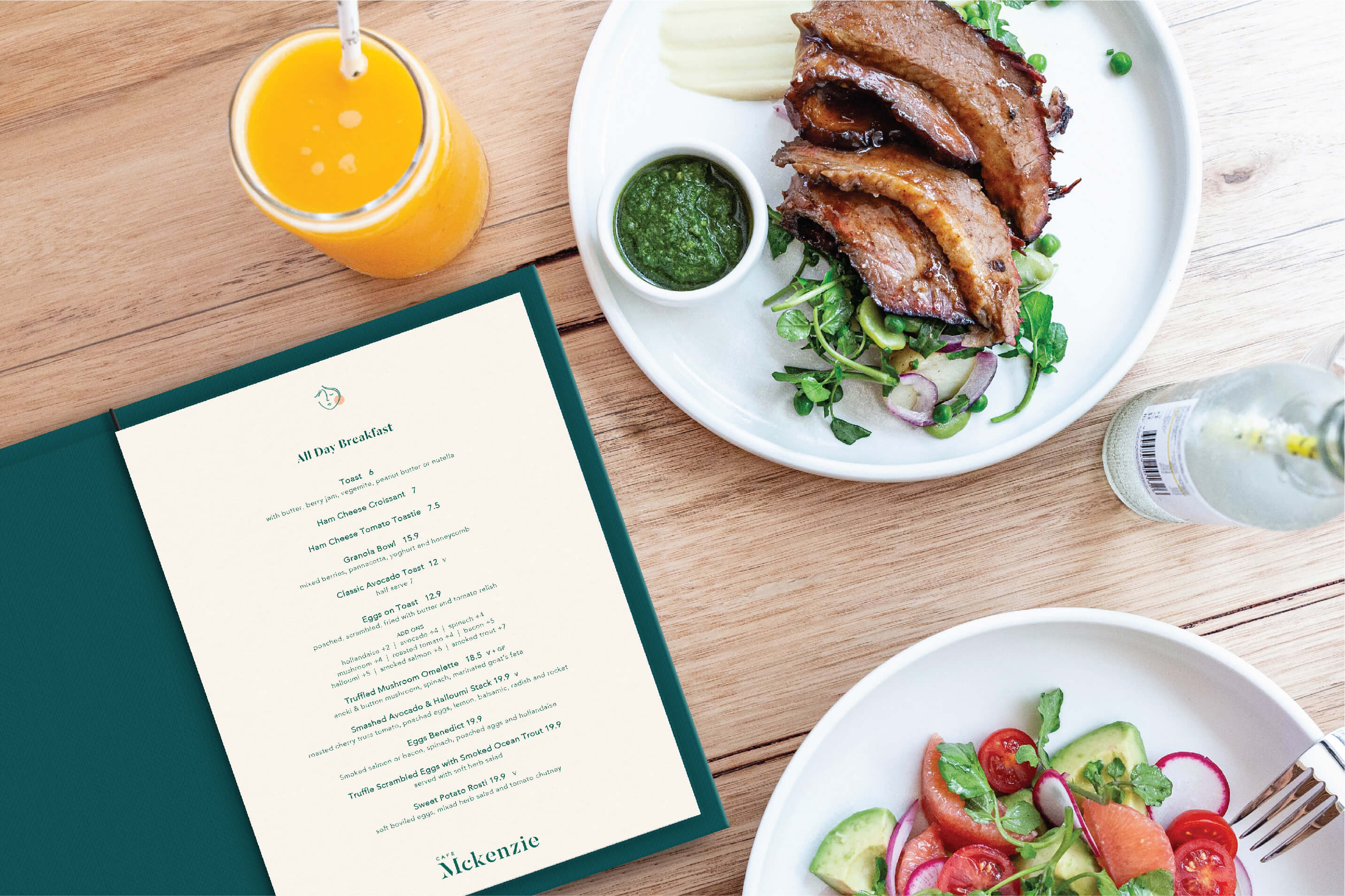
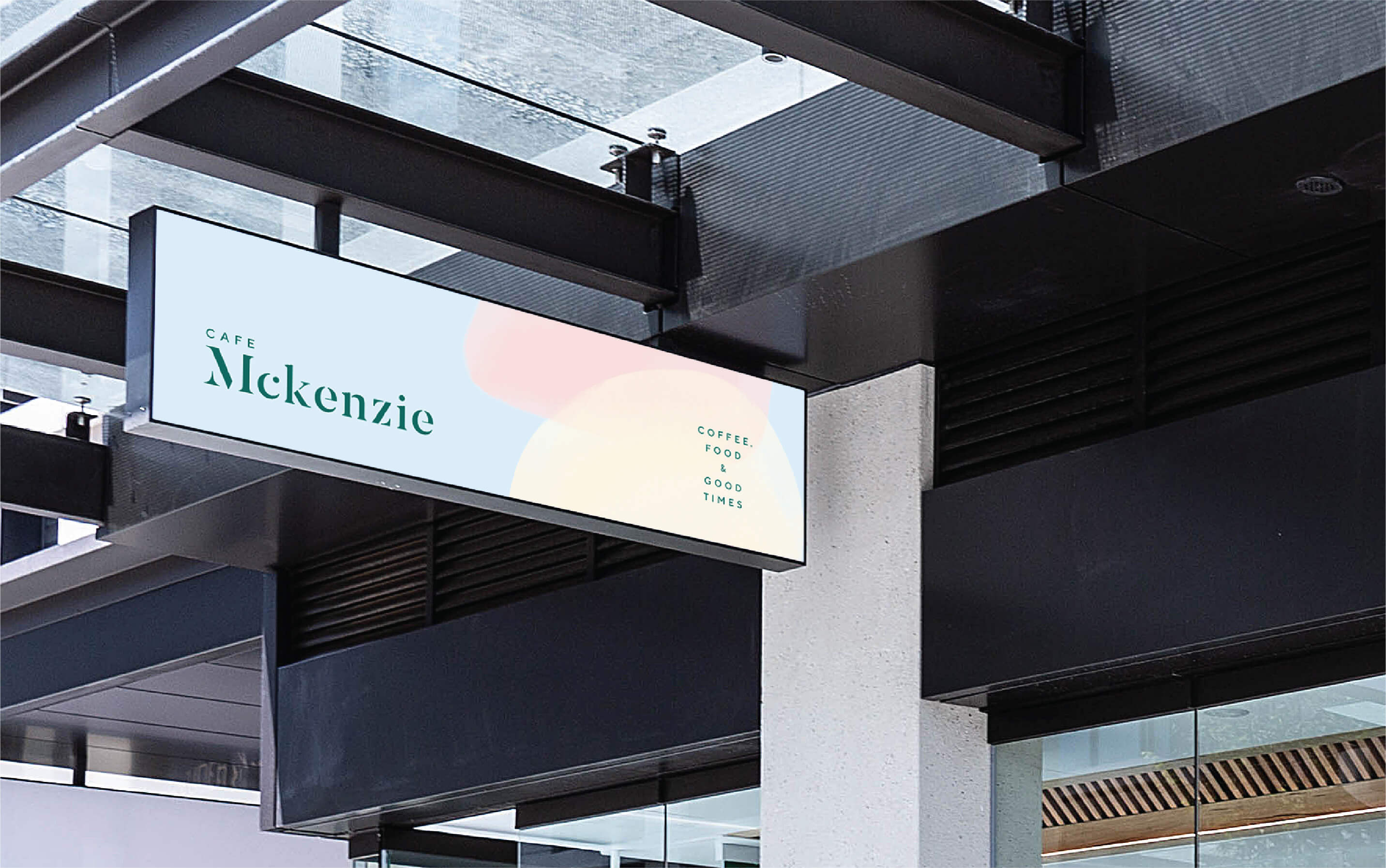
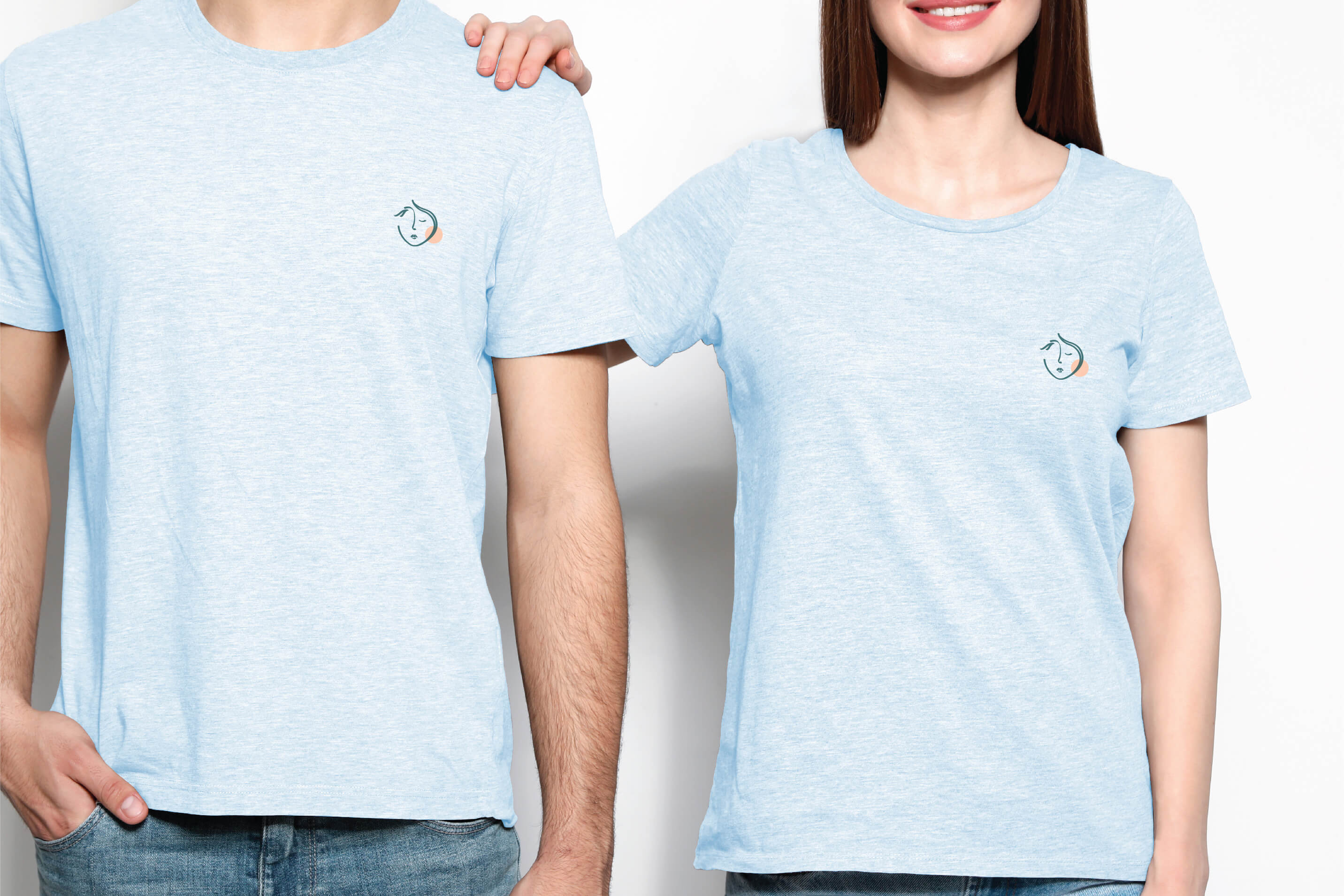
Café Mckenzie’s is aptly named after their second daughter Mckenzie. The brand is centred around the face of Mckenzie herself. To work in unison with the interior, Mckenzie’s face silhouette is stylised and sleek, with her signature rosey chubby cheek highlighted within the logo. This further forms the basis for the brand pattern, an abstract pebble pattern echoing the nature of the park directly adjacent to the café. The colour palette takes from the interior, featuring a dark emerald green alongside a mix of pastel blues, pinks and apricots.


