BRAND CREATION
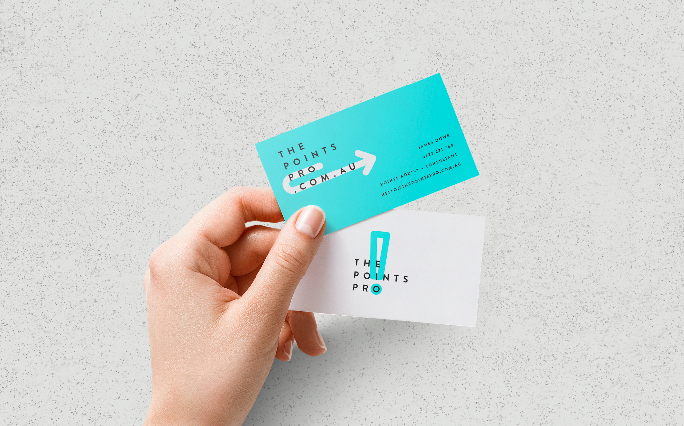
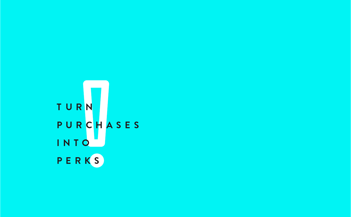
The concept behind The Points Pro logo is the idea of gridded structure overlaid with fun, fluid line work that creates a multitude of icons. This strong structure forming the base of the logo shows the notion of strategy, much like a crossword puzzle. By juxtaposing this with fluid line work in a fluoro blue, this gives maximum contrast and mimics the strokes of a highlighter pen. This results in a logo that is ever-changing and evolving, forming icons are indicative of what your points can do for you.


