REBRAND
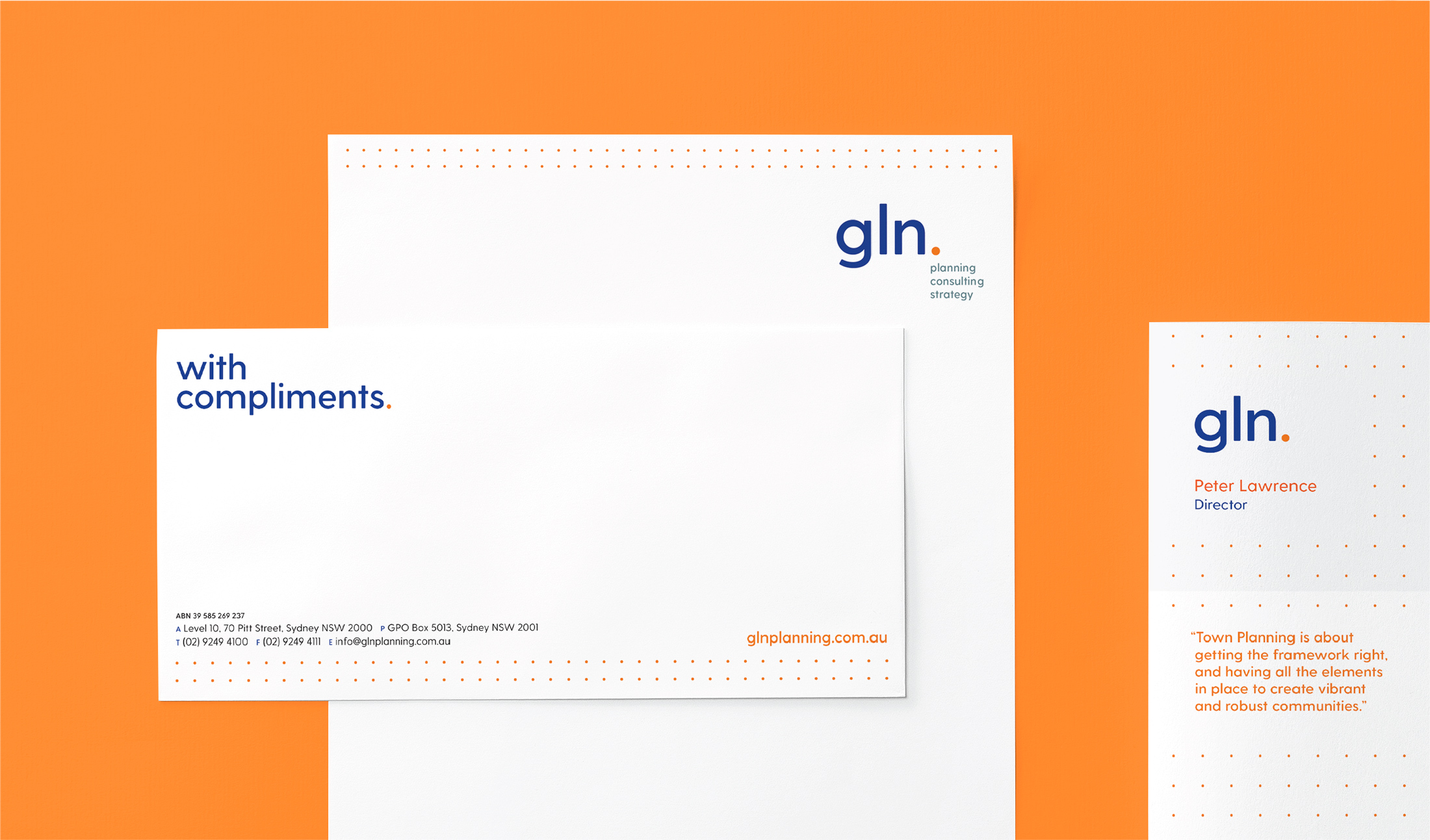
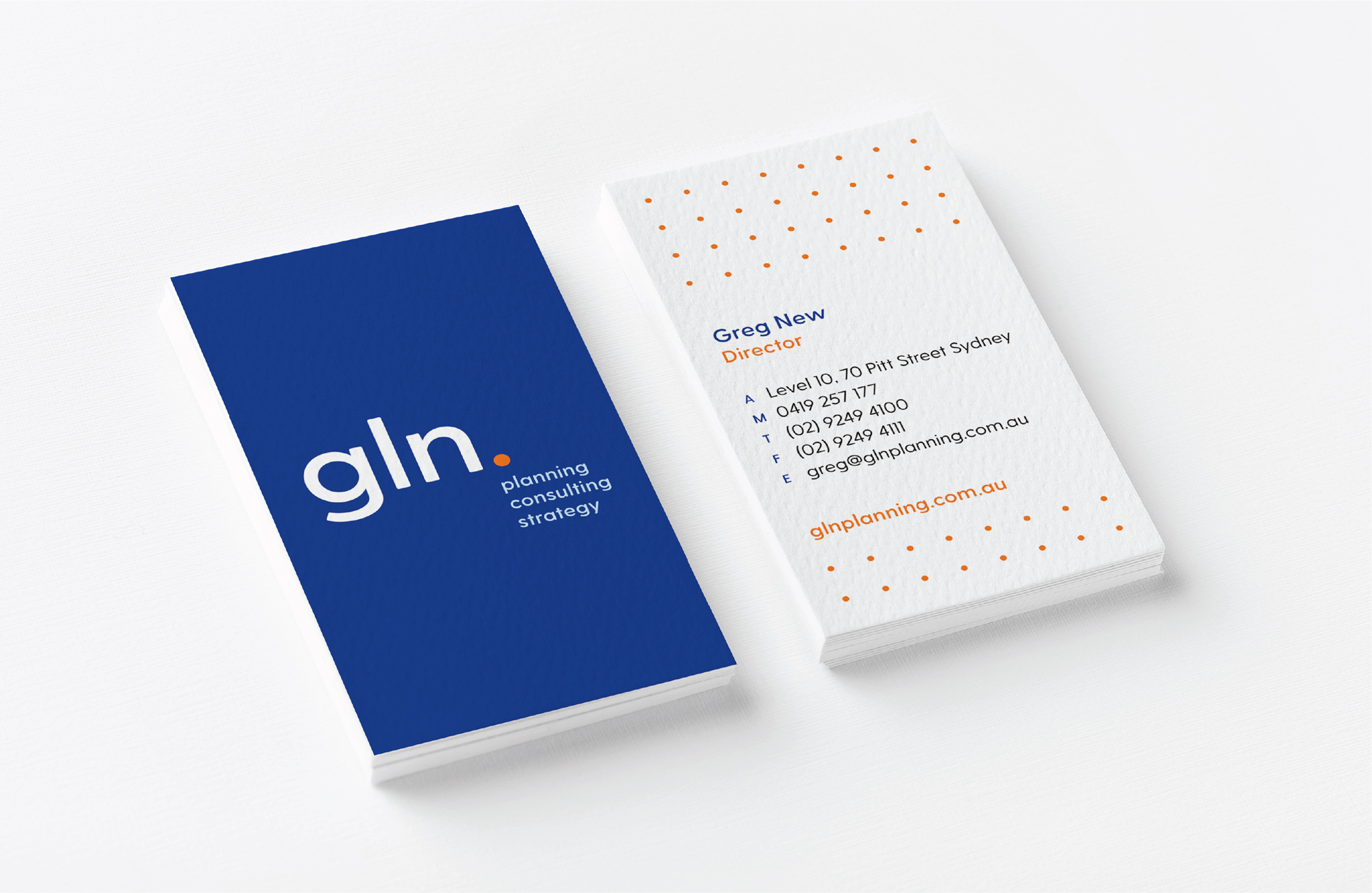
After 5 years of trading GLN Planning, was known in the industry as just ‘GLN’. Taking from this insight, the rebrand was clear. We highlighted this by adding a playful and definitive dot. This dot became the basis for their brand assets. It becomes a grid to show structure and planning. The dots are connected to show boundaries and the subdivision of space. Or the connected dots become pathways indicating movement and transport links. The firm has also widened their service offerings, so three strong call outs ‘planning, consulting, strategy’ were added to the logo. We retained the brand colours to give a sense evolution to the brand.


